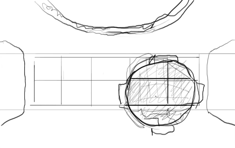
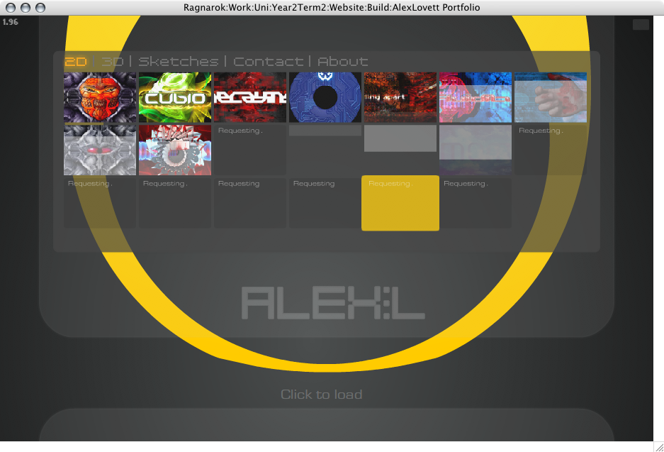
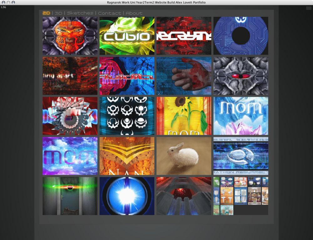
The Boxel:
What I have decided to call the Boxel, facilitates the organization and display of loaded thumbnails in a grid arrangement. The corners of the Boxel can be dragged to change the size and proportions and the thumbnails scale and arrange in the most optimal arrangement. It also (when necessary) loads in higher resolution versions of the thumbnail when scaled beyond the loaded size.
The Boxel will allow me greater freedom in how I display the thumbnails and even if desired allow user interaction so that the user may select the preferred dimensions of the thumbnails.
The white outer box is a defined perimeter than can be resized interactively. The goal of the Boxel is to fit the thumbnails into this box in the most optimal arrangement possible in order to draw them at the largest possible size while being constrained to the outer box.
I spent a long time trying to solve the problem of fitting boxes into a grid at the optimum numeration and arrangement. The solution I came up essentially pre calculates the best column/row ratio in order to fit into the height/width ratio of the containing box. Once the optimum column count is found the thumbnails are re arranged and then a separate chunk of code scales the Boxel to fit within the container. Thus resulting in the optimum column/row ratio.
The Loader
In order to manage loading thumbnails of different resolutions and of different sections, I wrote a manager to take care of the process. The loader creates a list of files to be downloaded and queue's them up so that only 2 are ran at a time. It tracks the progress of each item along with other information allowing it to effectively load the thumbnails. If an item errors or times out based on a set time frame (if it takes too long) it is moved to the bottom of the list, when an item finishes it removes itself from the list into a completed item list that tracks all loaded items so if they are requested to load again the manager knows they have already been loaded and ignores the request. This means I can request to load an image multiple times and it will ignore me if it is all ready loaded, which greatly simplifies coding the site as many things may be requested to load repeatedly.
It also facilitates batch removed of items based on category so that if the user switches section during loading of thumbnails, the current sections request to load thumbnails are removed (minus pending ones) this allows loading to keep focus on the most important items first. This facility will become of even greater significance in future versions of the site which will implement multi resolution versions of full images.
You wouldn't think this is so important, but during all my testing of Flash, it periodically screws up, so this functionality helps remedy that and better manage slow connections.
Duality Viewer
In order to facilitate the duality aspect of the site I have created what I call the Duality Viewer:
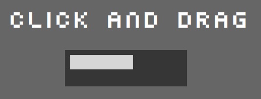
The first part of which is the capability to click and drag the mouse anywhere to increase and decrease a value, lets call the value DualPercent, the DualPercent is represented above as a white bar in a black box. The mouse must be clicked and dragged above a certain threshold to trigger the action in order to avoid accidental activate when only a click was intended.
The second part takes the value of DualPercent and displays the corresponding alternate image:
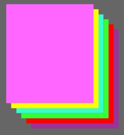
Click and drag in the .swf below to see it in action
As an example I have 6 coloured rectangles. Upon clicking and dragging the Duality Viewer displays the appropriate square while transitioning past and future squares transparency. This is the functionality that underpins displaying the alternate images, the colorful squares are replaced by full size images at varies stages.
The Duality Viewer can trigger any other number of effects besides this one such as tying in the value of DualPercent to background colors, border width or anything imaginable.
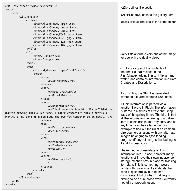
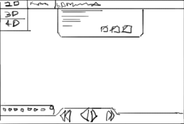
The XML Fetch
I have written an XML parser and generator in order to manage the items in the gallery. The XML generator is written in PHP and ran server side by analyzing the folder structure of the site and compiling a single XML file containing various attributes and information.
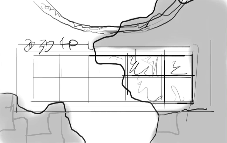
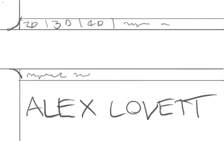
This is what the folder hierarchy looks like of 1 gallery item on my server:
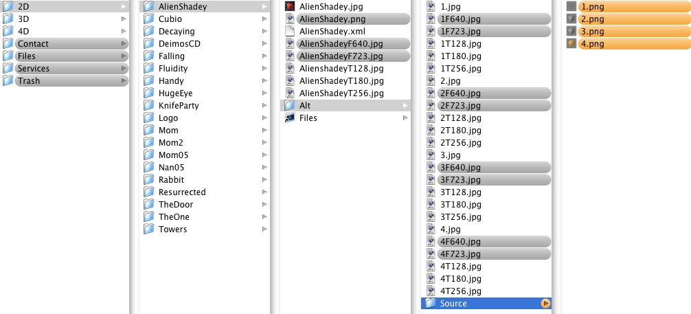
First you have the section Folders (2D,3D,4D), then the gallery items folders (AlienShadey), in the gallery items you have the full size images (AlienShadeyF640.jpg) thumbnails (AlienShadeyT128.jpg) and high res lossless original used to create them (AlienShadey.png), the Alt folder contains Alternate versions of the images (1F640.jpg) with thumbnails (1T128.jpg) and then a source folder containing the lossless originals (1.png)
Worth note each item contains multi res versions of both thumbnails and full size images (AlienShadeyF640.jpg). At current the full size counterparts are ignored and not used instead a fixed size images is loaded (AlienShadey.jpg).
The multi resolution versions including thumbnails are all generated via a custom made AppleScript which folders can be dragged and dropped onto for processing. This takes care of all resizing, compression and naming. All that is needed is a lossless full size .PNG image of the item.
The PHP code takes this folder structure and produces an XML from it that can be read in by by XML parser in Flash.
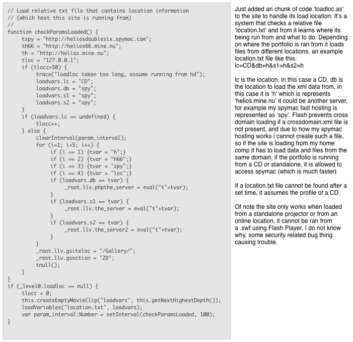
The XML that is dynamically generated could be saved as a static file and used as an input for the site instead. This would be essential if the site was to function offline on a CD, or run from a web server without PHP support. For example I have Spymac hosting that does not have PHP, It's a simple matter of uploading the XML result as a standard text file in It's place.
Some of the information contained in the XML is not currently used by the site but could be leveraged by future versions. Below is an example of the XML file generated by PHP, the example contains only 1 section '2D' and 1 gallery item 'Alien Shadey'
Designs and Concepts
There are a few visual styles I would like to try for the site.
1. Clean sharp, light, minimalist, elegant and pure. Focussed on uncluttered and tightly refined graphics.
2. Dark grey + sharp deep orange elements thrown in among the dark grey. A vector look, uncluttered and stylized.
I think a darker color theme would better suite my style, though I really want to keep it uncluttered and clean as possible.
I have a strong dislike for vector art and pixel art. I\'m my opinion the style was passe a long time ago and seems to be the refuge of copy cats and trend followers. Saying that, vector art done well can be very good, though It's hard to find it amongst all the noise. A quick browse through all the design magazines of the past few years shows tutorial after tutorial on how to vectorize photos and the like.
My preferred style is a bit hard to describe as none of my current work illustrates it, it has been several years since I have done any real photoshop work. The closest thing I have to my idea is something I did 2 years ago and never finished:

It uses high contrast neon highlights, 3D, vector, textural and photographic elements.
The new iPod adverts style is actually in a similar vein.
As I have outlined in the Brief, the sites design is to transition in some way between an inner and outer view. The outer view could be cleaner and vector like, the inner view could be more grungy and textured.
I want to create some kind of identity/logo for the site, something that represents me, and can be used to identify the site with.
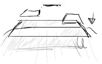
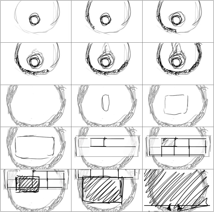
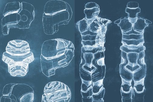
These are my initial sketches
Development included as: 'Sketches.mov'
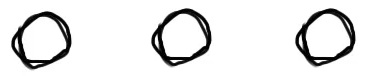
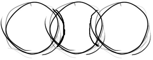
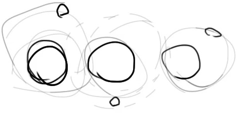
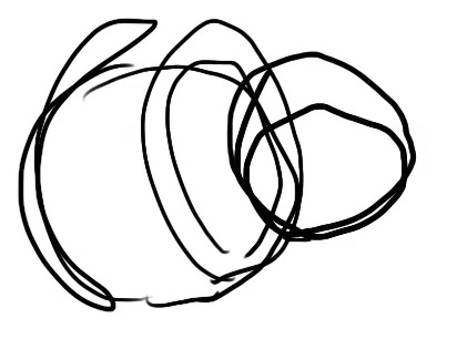
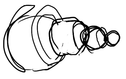
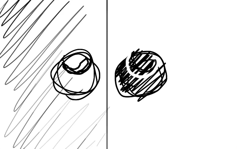
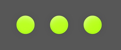
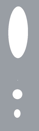
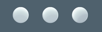
Starting here with the idea of using 3 circles.
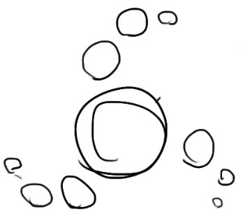
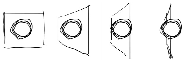
Trying out different arrangements.
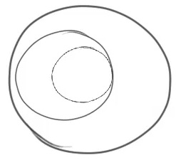
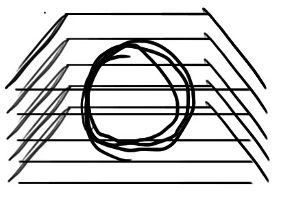
Thinking about the use of concentric circles to represent cores and some kind of inner outer relationship.

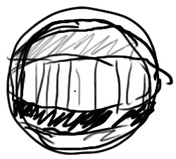
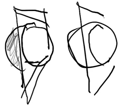
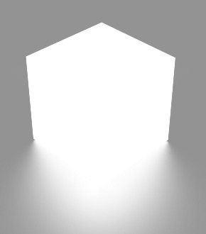
Here I have a hole with a ball in it, the part of the ball in the hole is drawn differently like some alternate x-ray view.
Taking the previous idea of using a hole, I think about creating an ident that is a hole. So wherever the ident is used, it shows through to the underneath. To the inside of the screen, inside of a wall or showing something behind the wall.
Thinking about layers and cores and showing in a three dimensional way an object being dissected.

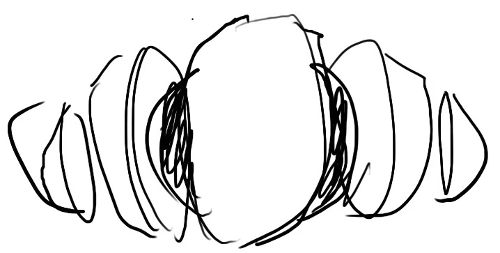
Thinking about layers/plants/petals unfolding

Layers falling down in perspective, then rotate round to face the viewer as a way of showing layers.
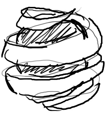
Animation of a sheet rotating round a sphere, the sheet could act like an x-ray type field as it spins.
An orange peeling type effect to revel an inner core
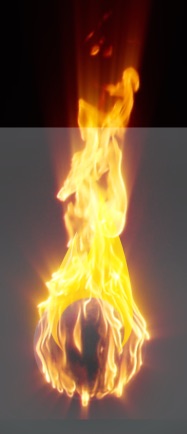
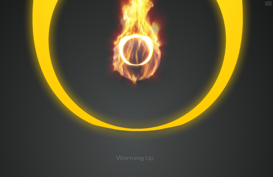
With the idea of fire now in mind, I started searching for stock video that could help me set this ball on fire. I found a perfect clip of an actual ball on fire. It fit perfectly and achieved the desired effect. It would still need tweaking to animate right and loop though. But it will need some tweaking to get it just right still
I just found stock video of a ball on fire! perfect!

Having to use Shake to crop movies! for gods sake!
WTF, the file actually contains no data, so It's more like, 0


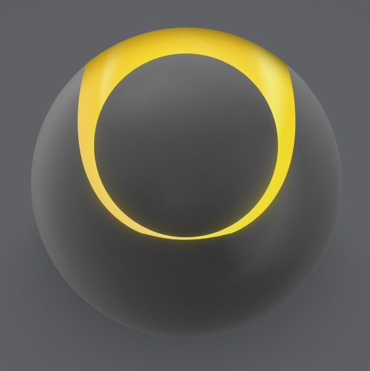
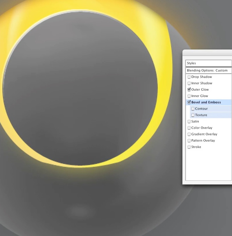
After removing the cube, I realized what I liked most about the fire illustration was the two resulting prongs within the sphere. With some adjustments, The result is a graphic that shows a circle within a circle.


just finished a comp in After Effects
I've had to bring in some other videos of fire, animate them sizing/moving in to make it look like the ball combusts
Also applying glows and shimmer etc
That is the result in Flash, comes to 128k
Now I can use it as a screensaver on my site!
:-)
I just found stock video of a ball on fire! perfect!
Having to use Shake to crop movies! for gods sake!
WTF, the file actually contains no data, so It's more like, 0
After removing the cube, I realized what I liked most about the fire illustration was the two resulting prongs within the sphere. With some adjustments, The result is a graphic that shows a circle within a circle.
just finished a comp in After Effects
I've had to bring in some other videos of fire, animate them sizing/moving in to make it look like the ball combusts
Also applying glows and shimmer etc
That is the result in Flash, comes to 128k
Now I can use it as a screensaver on my site!
The new After Effects is ace, the new UI is a huge leap and makes it much nicer and quicker to use.

I used After Effects to edit the flame movies together, adding filters to make it glow and sparkle more. Adding frames so that it looks like the fire starts from the ball and bursts out by overlaying another set of billowing fire and animating a clipping mask so that the fire appears to fire upwards from that. Then editing it so that It's loop-able. Also animated the ring of the ball to light up and shimmer.
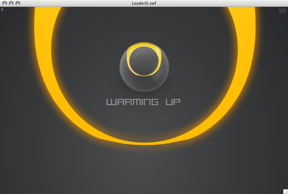
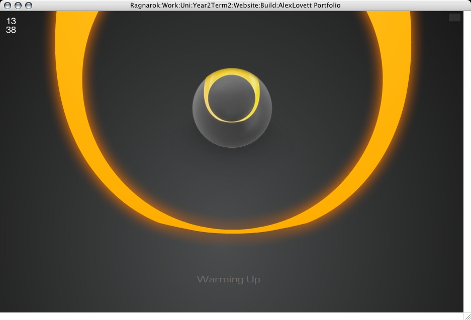
This animation will show when it is loading the main chunk of graphics of the site, At the moment this happens very fast, so It's not on screen for long, but In future as graphics are added this will server as the main loading screen.
A storyboard of my ideas for an intro scene. A large ring starts drawing around a ball to represent loading progress. Once the ring is complete, it zooms inwards and the gallery scales in and draws the thumbnails.
At the end, when a user clicks on a thumbnail, it grows larger to fill the screen leaving a gap where it was in the gallery.
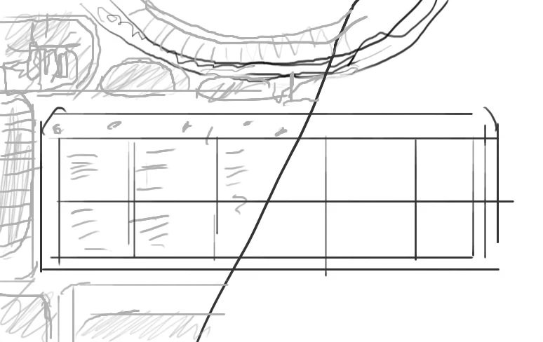
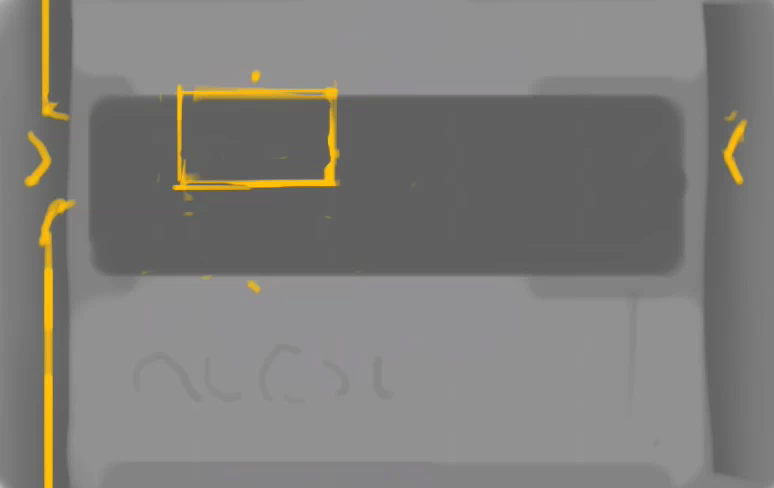
Sketching ideas for the layout of the gallery.
I like the idea of placing the thumbnails in a slide out segment at the top, that appears when the user moves within the top quadrant.
This would slide out atop of the section navigation and would make the site one place, removing the modality of switching from a thumbnail view to a full view.
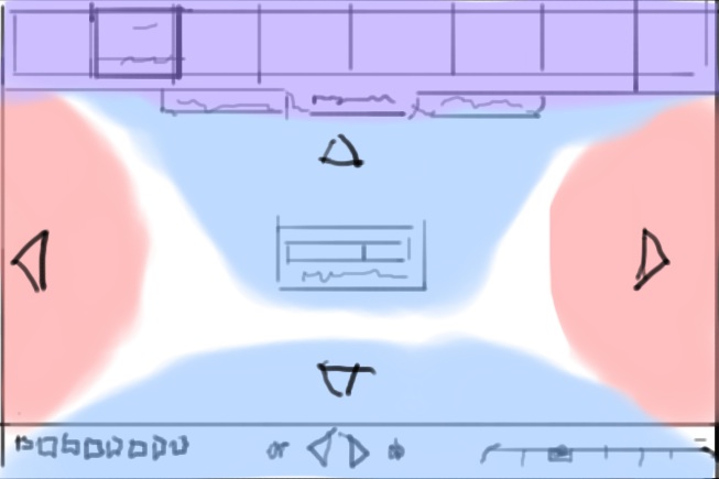
The colors represent my ideas of mouse within trigger spaces, when a user is within the red space arrows display and when clicked anywhere in the red space it performs the action of going next or previous. The blue areas when within slide out the corresponding element like a dock.

An xray type dissolve effect
Representing two sides to something in a special mirror.
An x-ray type magnifying glass
Ideas for an inner outer view, inside would should support structure for the graphical elements as
if it were a physical product
An animated beam, like a scanner, that comes across and reveals the inside view during the sweep

Just added a floating text widget:

This fades out as you slide to the left, but does not return, this way users are informed of the functionality n a fairly unobtrusive way, that is hidden in a simple manner. If I get round to adding a site memory function (so that it knows if a user has visited before, to remember visited images etc) I could have it display only till it is used and then never again.
The site graphics now in Flash complete with animation.
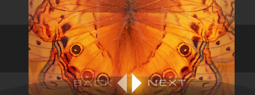
Working on Back, Next navigation in fullview. Added glows, and an eliptical backdrop to help visibility.
It's been a bigger pain than I had anticipated to get the graphics looking as I intended within Flash. Due to It's dynamic nature, the site may be drawn at any ratio or size, and designing for that is difficult. And coding for that, doubly so, my mind doesn't work very well with ratios and percentages and this work is absolutely loaded with them. After much struggle with relative positioning and scaling I have the graphics in line with my designed intention. And running at a pretty good speed after optimizations. Though the site still looks pretty stupid during intro on large display. Keeping a visual balance is so hard with dynamic layout
I've been tweaking the progress bars, the fullview progress bar now has a nice animation when fading in and out, taking advantage of Flashes new blur filter.
Status text shrunk and repositioned below ring.
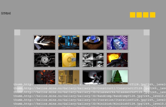
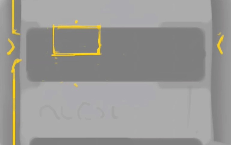
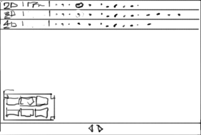
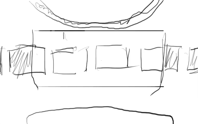
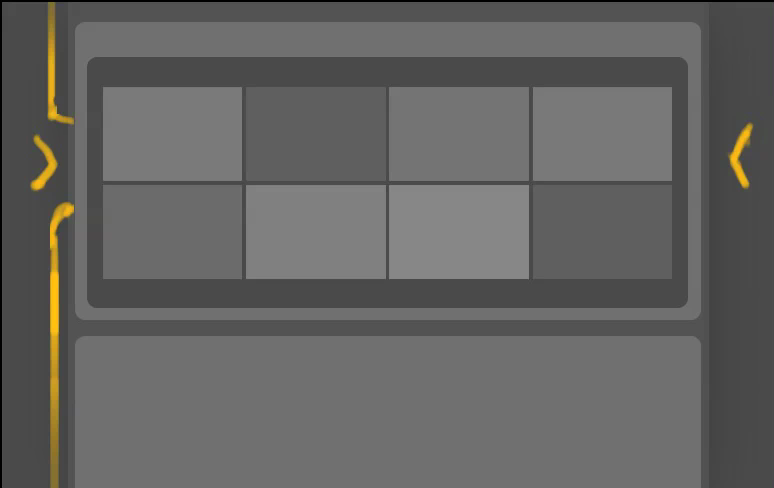
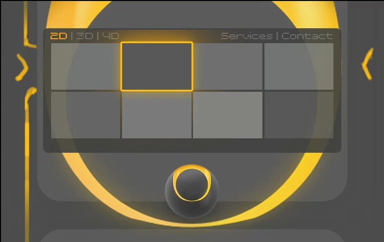
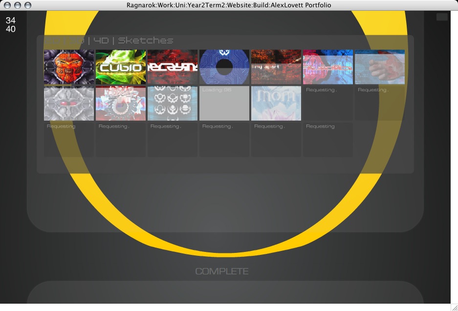
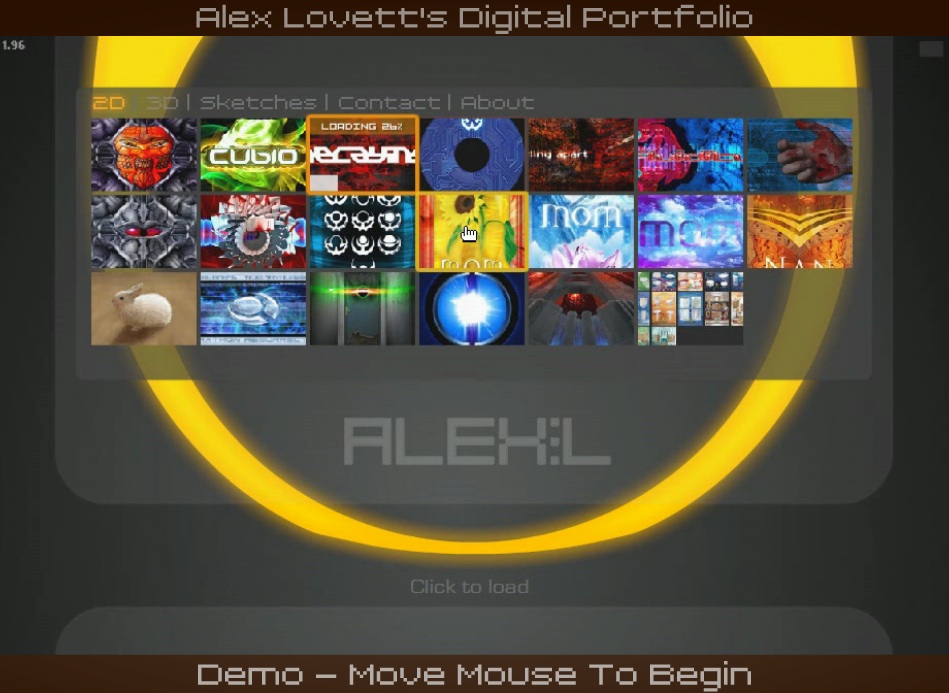
Below a shot of it loading thumbnails into the grid.
The thumbnail highlights/rollovers are not as spiffy as I'd like. I can't do them as I had designed due to... complexities involved with layering.
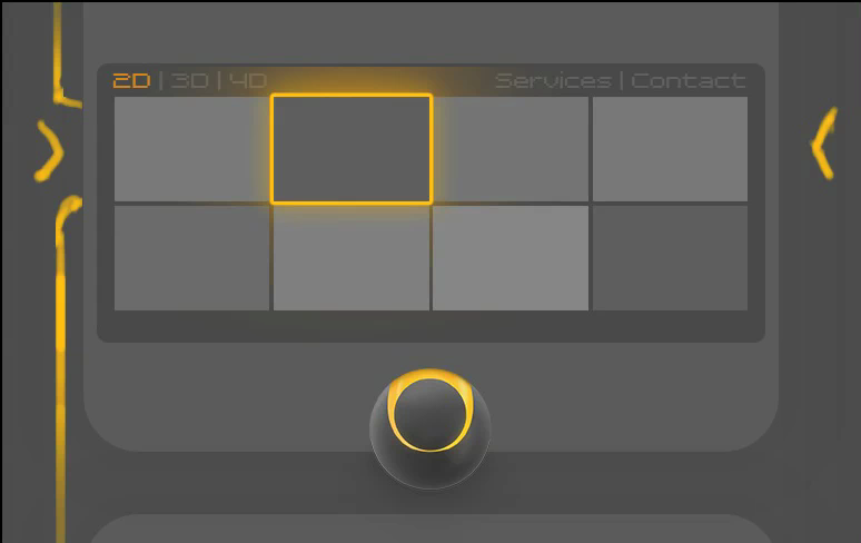
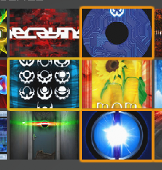
Darker orange denotes it has been loaded and viewed, yellow outline denotes it is under the mouse cursor and can be clicked.

Added section rollover highlights

Added an intro and exit animation on the close button tooltip. It's only subtle and short, but that's how I like it.
Fixed a faint button in the top right of the stage, that when clicked toggles stats on and off
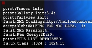
These help while debugging the site, especially when ran from a browser which has no trace window. It also turns on the FPS meter which Is important when optimizing the speed.
Would like to add inner views to all the sketches, I have the idea of simply fading between an inverted version of the same image, because that actually makes sketches look pretty weird and x-ray. But I want to do that in code, not with physically making inverted duplicates, would take forever. I've physically done it with a couple of sketches:
It's been a bigger pain than I had anticipated to get the graphics looking as I intended within Flash. Due to It's dynamic nature, the site may be drawn at any ratio or size, and designing for that is difficult. And coding for that, doubly so, my mind doesn't work very well with ratios and percentages and this work is absolutely loaded with them. After much struggle with relative positioning and scaling I have the graphics in line with my designed intention. And running at a pretty good speed after optimizations. Though the site still looks pretty stupid during intro on large display. Keeping a visual balance is so hard with dynamic layout
I've been tweaking the progress bars, the fullview progress bar now has a nice animation when fading in and out, taking advantage of Flashes new blur filter.
Status text shrunk and repositioned below ring.
Below a shot of it loading thumbnails into the grid.
The thumbnail highlights/rollovers are not as spiffy as I'd like. I can't do them as I had designed due to... complexities involved with layering.
Darker orange denotes it has been loaded and viewed, yellow outline denotes it is under the mouse cursor and can be clicked.
Added section rollover highlights
Added an intro and exit animation on the close button tooltip. It's only subtle and short, but that's how I like it.
Fixed a faint button in the top right of the stage, that when clicked toggles stats on and off
These help while debugging the site, especially when ran from a browser which has no trace window. It also turns on the FPS meter which Is important when optimizing the speed.
Would like to add inner views to all the sketches, I have the idea of simply fading between an inverted version of the same image, because that actually makes sketches look pretty weird and x-ray. But I want to do that in code, not with physically making inverted duplicates, would take forever. I've physically done it with a couple of sketches:
About Page
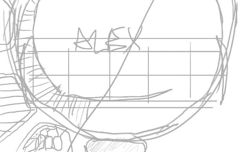
I have finally added my own name to my own site! ALEX:L Next I start work on adding an About page, this is to give a brief outline of what I do, what's special about this site, and that I'm available for hire.
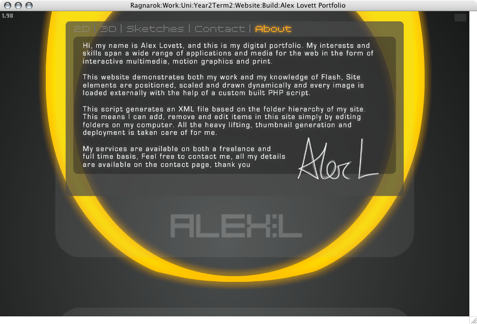
I had the idea to use my signature to personalize it more, I signed my name using my tablet and then traced over it with the pen tool in Photoshop, the tablet drawn signature is faintly underlaid.

I've added an odd new behavior to the site, which is well.. It's cool and semi useful while also showing off that the site really is dynamic. I was hoping to create some nice graphics and animation for the 'inner view' of the website. But there's just not been time to clean up that concept or think about implementing it. So instead I have tied a few parameters to the duality slider such as width and height restrictions on the boxel and, well It's easier to just use it and see. When dragging left and right while looking at the site (not fullview) the site re arranges itself so that the thumbnails take up the full stage size and pushes my name off the bottom and hides the ring graphic. I think It's cool, What I want to do is have some kind of visual or interaction take place wherever you are when you use the duality slider, so the user knows it does something.
Below is it in 3 stages, normal, part way, and full.
Contact Page
Working on adding a Contact page to the site:
First idea to use concentric circles again. This design might make for an interesting business card that's round and not square, though It's difficult to get readable text into this size.
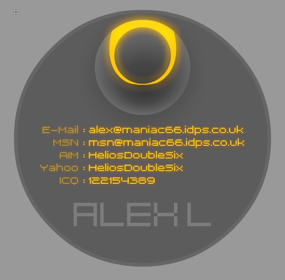
you can see that it is drawing it quite small, I'm limited in my vertical height,
my layout prefers more landscape orientated pages and so I set about redesigning it.
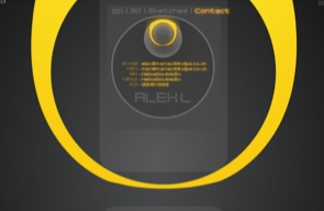
The second version fits the layout much better:
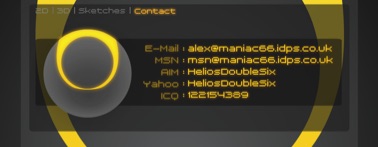
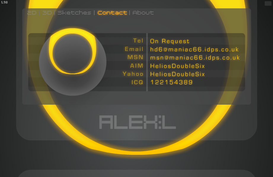
And now the design further refined below, change of type face and other subtleties. Made the ring animate a little glow
Screensaver
I have now implemented a screen saver function, as I am presenting this as a kiosk, I want it to be displaying things while people are not interacting with it. And so the portfolio detects when it has been inactive for a set period, and then displays a screen showing a video of the site being used with text explaining it is a demo:
As soon as the mouse is moved the site resets and starts loading from the beginning. You can press 'R' to reset to portfolio at any time. It was actually really hard to do that simple task. To reset the site to the very beginning, without actually re opening it. Because it loads so many variables and files which have to be cleaned out. In order to do this I had to create a new container that loads the site within it.
So now the site loads a Launcher.swf which is very small size, that file detects where the file is being played from in order to load data from the correct location (eg if It's loading from a CD or my website or some other exception) and then loads the loader.swf, the loader.swf loads the console, tracer, duality and fullview, and then the console loads the gallery, so lots of modules, but now they function pretty well independently.
In order to record a movie of myself using the site, I set the Flash FPS settings to 10fps and then recorded the screen at 10fps later speeding up the recording so it appears like normal speed, this was so that it ran super smooth and negated any impact on CPU the screen grabbing process was taking.
All sorts of problems have been encountered every step of the way with this project, simple things like loading an external .FLV and looping it, seem so simple on the surface, but require a lot of digging in manuals and fiddling to get round the many awkward security restriction flash now imposes. But I'm learning!

and I've added some code and animation to handle changing colour to show what current section the user is in. Orange is current section, Yellow is rollover. This helps the user understand where they are, and should make the navigation more apparent now it has a glowing orange bit lit up.
Final Shots
The ring fades thru Red, orange and yellow like It's heating up. And then he ball bursts into flames.
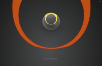
then he ball bursts into flames.
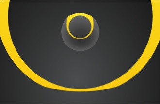
The Ring zooms into view, likes It's revealing an inner self.
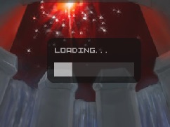
Thumbnails start loading. Grey faint squares represent the progress and look cool then the thumbnail fades in.
An enlarged view of how my site looks on a larger screen, higher quality thumbnails load in place.
I have finally added my own name to my own site! ALEX:L Next I start work on adding an About page, this is to give a brief outline of what I do, what's special about this site, and that I'm available for hire.
I had the idea to use my signature to personalize it more, I signed my name using my tablet and then traced over it with the pen tool in Photoshop, the tablet drawn signature is faintly underlaid.
I've added an odd new behavior to the site, which is well.. It's cool and semi useful while also showing off that the site really is dynamic. I was hoping to create some nice graphics and animation for the 'inner view' of the website. But there's just not been time to clean up that concept or think about implementing it. So instead I have tied a few parameters to the duality slider such as width and height restrictions on the boxel and, well It's easier to just use it and see. When dragging left and right while looking at the site (not fullview) the site re arranges itself so that the thumbnails take up the full stage size and pushes my name off the bottom and hides the ring graphic. I think It's cool, What I want to do is have some kind of visual or interaction take place wherever you are when you use the duality slider, so the user knows it does something.
Below is it in 3 stages, normal, part way, and full.
Contact Page
Working on adding a Contact page to the site:
First idea to use concentric circles again. This design might make for an interesting business card that's round and not square, though It's difficult to get readable text into this size.
you can see that it is drawing it quite small, I'm limited in my vertical height,
my layout prefers more landscape orientated pages and so I set about redesigning it.
The second version fits the layout much better:
And now the design further refined below, change of type face and other subtleties. Made the ring animate a little glow
Screensaver
I have now implemented a screen saver function, as I am presenting this as a kiosk, I want it to be displaying things while people are not interacting with it. And so the portfolio detects when it has been inactive for a set period, and then displays a screen showing a video of the site being used with text explaining it is a demo:
As soon as the mouse is moved the site resets and starts loading from the beginning. You can press 'R' to reset to portfolio at any time. It was actually really hard to do that simple task. To reset the site to the very beginning, without actually re opening it. Because it loads so many variables and files which have to be cleaned out. In order to do this I had to create a new container that loads the site within it.
So now the site loads a Launcher.swf which is very small size, that file detects where the file is being played from in order to load data from the correct location (eg if It's loading from a CD or my website or some other exception) and then loads the loader.swf, the loader.swf loads the console, tracer, duality and fullview, and then the console loads the gallery, so lots of modules, but now they function pretty well independently.
In order to record a movie of myself using the site, I set the Flash FPS settings to 10fps and then recorded the screen at 10fps later speeding up the recording so it appears like normal speed, this was so that it ran super smooth and negated any impact on CPU the screen grabbing process was taking.
All sorts of problems have been encountered every step of the way with this project, simple things like loading an external .FLV and looping it, seem so simple on the surface, but require a lot of digging in manuals and fiddling to get round the many awkward security restriction flash now imposes. But I'm learning!
and I've added some code and animation to handle changing colour to show what current section the user is in. Orange is current section, Yellow is rollover. This helps the user understand where they are, and should make the navigation more apparent now it has a glowing orange bit lit up.
Final Shots
The ring fades thru Red, orange and yellow like It's heating up. And then he ball bursts into flames.
then he ball bursts into flames.
The Ring zooms into view, likes It's revealing an inner self.
Thumbnails start loading. Grey faint squares represent the progress and look cool then the thumbnail fades in.
An enlarged view of how my site looks on a larger screen, higher quality thumbnails load in place.

The End
Well, my schedule plan as always went out the window after problem after problem arose. But I knew that would happen, the buffer zone was used entirely, but I have got it all done, near enough. Some things got laid to the side, such as the matrix-esque inner view ideas I had in mind. They might have been cool, but they all might have been incredibly CPU intensive, I'll never know.
The site works, it is for the most part very stable now, no obvious bugs or holes or trappings. Some timings can go out when resetting the portfolio but I'm hoping they are just rare and won't show up in real world use. I have my Mac mini setup running Windows and auto loading my portfolio and setup a internal web-server to server the data my site looks for, so it doesn't require an internet connection. Would have been nice to code in a offline loader, but this is just easier and really everyone has net, and I want the most up to date version of my stuff in circulation anyway.
I remember in the distance past to arrange and display nestled interactive work along with projects of increased depth in the form of the 4D section. The mind numbing complexity of showing multimedia work in a multimedia site still escapes me. One day ill attempt it, but not this day, I have made up for it by shoving my Sketches as a section unto itself. I can always use the duality view as a means to view projects with multiple elements, I have to a degree with the addition of some color spreads I did for a bathroom company aeons ago, and it works, but It's not quite right for that purpose yet, as It's hard to fixate on one variation without it sliding thru to the next a touch, some snapping needs to be implemented.
Some rough edges still, the status text needs to be better positioned around the ring, it can overlap it. And the alternate images (shown in the dual view) don't show load progress, they just load, and hopefully finish before you try and see them, fortunately this effect is not visible most of the time (if the net is fast) and thus the kiosk won't show this flaw at all.
Would I do anything different in hein-sight. Perhaps, maybe id make a trailer of my work instead!.. now that's got me thinking.
But in all honesty I like what I've achieved, I like it a lot, and it works, which is always good.
Now I need to add some good work to it, stuff without 'Mom' in it, and no more furry creatures.
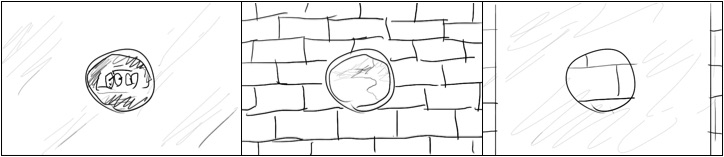
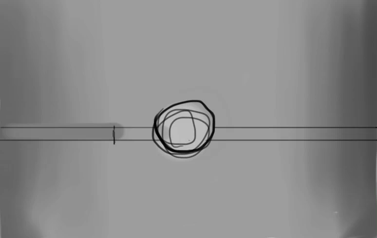
Trying out shapes and arrangements around the theme of circles.
Keeping the sketches I have done in my head as inspirations.
The concepts of inner and outer, circles, and various imagery I have been playing with.


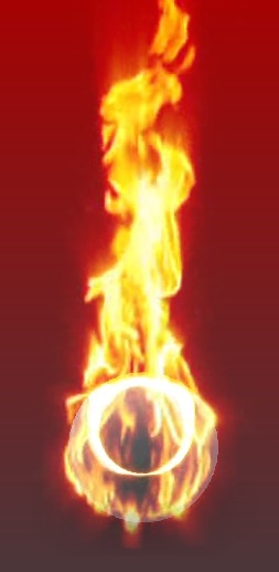
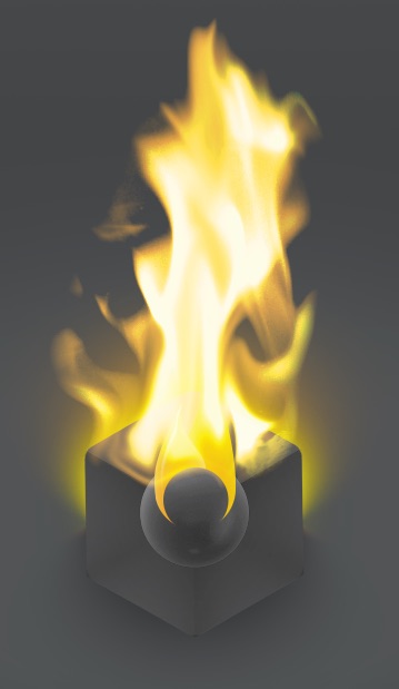
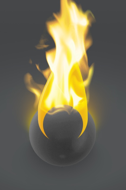
I started playing with glows and ended up trying out a fire effect which got me thinking about a potentially dramatic use of fire in the ident. Also I want to represent all the facets of what I do, 2D, 3D and Animation. So the cube is 3D, the circle is 2D and the fire is animated.
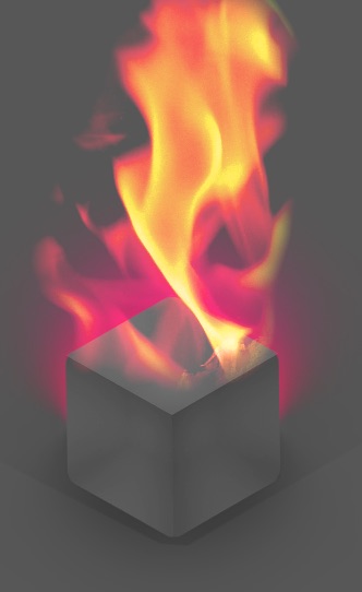
I tried representing the fire with an illustration. And then decided to remove the cube entirely leaving just the ball and the fire.

Keeping the sketches I have done in my head as inspirations.
The concepts of inner and outer, circles, and various imagery I have been playing with.
I started playing with glows and ended up trying out a fire effect which got me thinking about a potentially dramatic use of fire in the ident. Also I want to represent all the facets of what I do, 2D, 3D and Animation. So the cube is 3D, the circle is 2D and the fire is animated.
I tried representing the fire with an illustration. And then decided to remove the cube entirely leaving just the ball and the fire.


Development included as: 'Logo2.mov'


*rubs eyes* I'm awake, lets see if we can have a good solid day with stuff in the right order.
My Logo design concepts and work for my own logo:
Spinning vertically rapidly

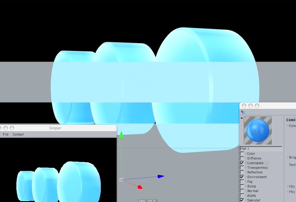
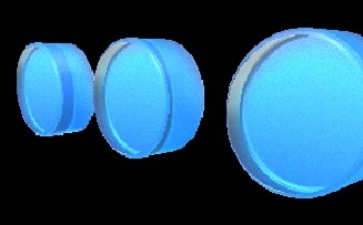
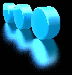
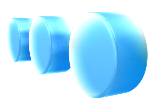
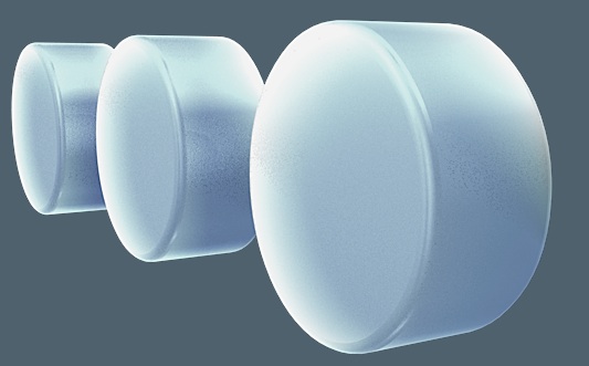
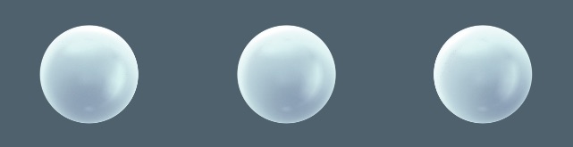
My explorations into using 3 circles but in a 3d dimensional form. Playing with potential textures/materials I could use.
Development included as: 'Logo1.mov'

Show Work
not entirely sure if group work towards the show is wished for here, but I shall include as paper is cheap these days.
I worked on both a simplistic showreel and website for the end of year show
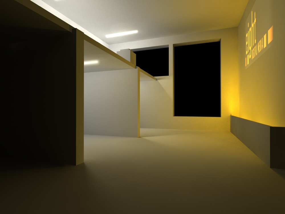
This is a piece of concept work for how we could use one of the rooms at green lane, blacking out the windows.
These are some concepts regarding the theme of 8 we chose to represent that there are 8 of us on the course. None of these ideas ended up being part of what we now have as a show ident.

I designed and created the show website under guidance of the group.
The show reel should also be available on that site, It's not very exciting, just does It's job.

These are some concepts regarding the theme of 8 we chose to represent that there are 8 of us on the course. None of these ideas ended up being part of what we now have as a show ident.
I designed and created the show website under guidance of the group.
The show reel should also be available on that site, It's not very exciting, just does It's job.

